NAV
UX/UI Design
Navigating post-graduates towards fulfilling careers and opportunities

NAV
NAV is an app that helps post-graduates navigate towards fulfilling careers and opportunities after graduation. It allows users to connect with a mentor, attend networking events & workshops, and access career resources to help them start their career journey.
Project Overview
-
Project Type
Academic June-August 2021
-
Timeline
10 Weeks
-
Role
UX Researcher, Design Strategy, UX/UI Designer
-
Tools
Figma & Invision
Design Challenge
“Graduation is not the end, it’s the beginning.”
The inspiration came from a personal struggle that I experienced after graduation. Not knowing what career I wanted to pursue, I felt lost and confused. But upon talking to friends and family, this feeling that I was experiencing was very prevalent and normal for post-grads. After exploring different fields of interests and working different jobs, I was able to narrow down what I was truly passionate about. But is there a more efficient way for post-graduates to navigate towards a fulfilling career?

Design Process
My design process was focused around the Double Diamond Design Process which consisted of four main steps.

Discover
Discovery of Problem Space

Post-graduates often feel lost and confused about what career path to pursue after graduation due to lack of resources, exposure to other fields of interests, not enough guidance, and much more.
Based on a study from the Federal Reserve Bank of New York, they found that only 27 percent of college graduates work in a field related to their major.
Secondary Research
Based on secondary research, I found data that further supports the issues of what post-graduates face after graduation.

Why are post-graduates feeling this way?
According to City Mental Health Alliance, it has been observed that there is a correlation between people not being able to find long term work and not being able to reach their goals is harmful to their mental health.
The Co-founder of Allaboutcareers.com expressed that there are worrying statistics that emphasize the need for high quality, free and easy access to career information for young people.
Jane Oates (former Official in the U.S. Department of Labor) mentioned that there is a strong case for work-based learning. Education systems are not prepping students well enough for the workplace.

Hypotheses
Based on the secondary research, I believe that post-graduates have a difficult time figuring out what they want to pursue after graduation due to lack of resources, networks, and knowledge on what else out there. This can lead to a lot of confusion and negative effects on their mental health.
I will know I’m right when I see the following feedback from the market based on the similarity between each participant’s feelings towards post-grad life and what they are currently pursuing in terms of their career.
Primary Research
To prove my hypotheses and to further understand the problem space, I conducted user interviews on recent post-graduates to gain more insight on their thoughts and feelings towards life after graduation. Based on the user interviews there were 3 main themes that were derived.
“The students that were successful after graduating had guidance and it was easier for them to transition into a career.”
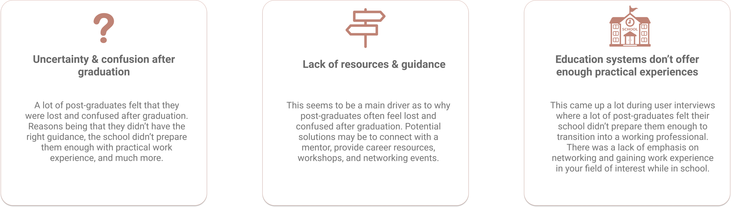
Key Theme
Lack of resources and guidance
The theme I will be focusing on for the digital solution will be lack of resources and guidance. This seems to be a main driver as to why post-graduates often feel lost and confused after graduation. Potential solutions may be to connect with a mentor, provide career resources, workshops, and networking events.
What’s already out there?
An online platform that is used to build and engage with your professional network, access knowledge, insights, and opportunities.
-
•Users have the ability to connect with millions of professionals around the world with various professional backgrounds
•The ability and easy to send direct messages to people you want to build a professional connection with.
•Can customize profile to your personal work experience and what you’re looking for.
-
•Can be difficult to build lasting professional connections.
•User interface can be overwhelming and can affect user experience.
•Can be difficult to stand out to millions of other users.

Define
How Might We Statement
How might we guide post-graduates to find fulfilling opportunities in their desired field of interest in order to avoid the effect confusion has on their mental health?
User Persona
After conducting secondary research and user interviews, I was able to create a primary user persona that represented my target market. Based on insights derived from research and interviews, I was able to pin-point the goals & motivations, behaviours, and pain points of the user.
Lucy Garcia is a recent graduate in Psychology but wants to transition into UX Design.


Lucy’s Current Experience
With the user persona constructed, I was then able to create an experience map that outlines how the user currently may deal with the issues of finding connections and opportunities after graduation. By analyzing and identifying the different stages and emotions of the map, I was able to establish any opportunities within the user’s experience.

What are some opportunities?
Based on Lucy’s current experience, I was able to identify possible areas to alleviate her pain points.

Develop
Task Selection Process
Epic
Based on the HMW statement and the user persona created, I then developed a set of 30 user stories under 3 epics to help me better understand the task selection and flow. After analyzing the user stories and epics, I chose my primary epic to be To connect with a mentor. Reasoning is due to the fact that post-graduates feeling that they don’t have guidance to help them in their career journey. By connecting with a mentor, this may help alleviate the issue at hand.
User Story
As a post graduate I want to be able to connect with a mentor outside of the field of psychology to learn more about UX design.
Task Flow
By determining the primary epic and user story, I was able to create a task flow of how the user would interact with NAV.
Main Task
To connect with mentor in UX Design.
Pre-condition
User has already created their profile and selected their field of interests within UX Design.
Main Task Flow

Ideation Sketches
The exploration of various layout and components of the app was done through Crazy 8’s (process of sketching 8 various concepts). The top 2 concept sketches are below. Overall, I explored various layouts on how to translate certain features of the design solution.
Some key elements that I wanted to focus on was a clear list of mentors screen, an engaging mentor’s profile screen and an easy to follow request form.

Solution Sketch
After analyzing the concept sketches, I was able to refine certain elements I like from both concepts and merged the two. I chose the following layout and components that I thought were a good fit with my visualization of the design solution. The goal is to have a clear layout for users to easily navigate the digital solution.

Wireframes
After the solution sketches, I was able to refine the drawings a bit more by translating them into wireframes and prototyping it on Figma. This gave me a better understanding and feel of how the app would look. With that being said, while designing the wireframes, I was able to make more adjustments and be more detailed in regards to how I wanted the screens to look.


Deliver
User Testing
Summary
The purpose of the usability test is to gain feedback and insight on how a user interacts with the digital solution. There were 10 testers and 2 rounds that took place over a span of 2 days through Zoom. Overall, the usability test went well, all users were able to complete the tasks and understood the purpose of the app.
Below are the key changes made from user testing that were high impact and affected the overall user experience of the app.
Scenario
Participants will be given a scenario to put themselves in the user’s shoes along with given tasks to further evaluate the usability of the app.
Participant Criteria
Recently graduated from college/university within the past 2 years
Key Revisions

Revised Login Screen
Feedback received was to add in a forget password option for users that need further assistance.

Revised Filter Option
Feedback received was to create more options to filter by category.

Revised Mentor Profile Screen
Feedback received was to create a ‘Read more’ option for users so that this section wouldn’t look to text heavy.

Revised Mentor Profile Screen (V2)
Feedback received was to add a carousel to profile which mentors could add more media for themselves. As well, add in the ratings to each comments so users will know how they’re rated.
Final Revised Wireframes
With two rounds of user testing, I was able create a final prototype with the revisions made. Overall, the feedback given was more visual suggestions that were high-medium impact but low effort to fix.
Below are the revised main screens that users will interact with.

Visual Design
Mood board and Color Exploration
The mood of NAV will be exciting, comforting, modern and professional. After curating pictures of the mood board, I was able to derive some colors that I could potentially use as brand colors.
The colors derived from the mood board turned out to be darker than I liked. So I played around with different hues of blue and yellow on Figma. I knew wanted to stick within the blue and yellow family because blue represented security and prosperity, while yellow is very warm an energizing. These two colors represents the target user well and the purpose of the app.
After settling on the brand colors, I was then able to explore different hues on the colors I chose to be used as accents throughout the app. Along with that I also choose semantic/feedback colors, functional, and neutral colors for certain components of the app.


Visual Design
Word mark and logo development
My idea for the word mark was to keep it simple, clean and modern. I knew I wanted to use sans serif fonts because it definitely looked more modern.
I decided to go with SF Pro Display for the font of the word mark.
In addition to the name of the app, I wanted to incorporate a logo into the word as well. When I first think of NAV, I think of a compass directing someone. Thus, the compass represents guiding post-grads into fulfilling careers and opportunities. Also, I didn’t want the word mark and application icon to just be black. Thus, I incorporated the brand colours into the icon and word mark.


High-Fidelity Design
After thoughtful considerations of the color, word mark, and typography, I was then able to insert all the selected styles into the app.

Marketing Website
With the high-fidelity prototype done, the next step is to think about how I’m going to convey and sell the digital solution to potential users. Therefore, I created a marketing site, along with a responsive mobile web. When designing the marketing site, it’s important to consider how the UI layout would respond to other devices. As well, you want to incorporate selling points within the UI and prioritize certain sections to entice the consumer.

Future Thinking
With the development of my final prototype, I started thinking about how the app would be showcased across different devices. I chose to design the home screen on an iPad because based on user insights, users typically use similar apps on either use their phone or tablets. The overall layout between phone and tablet are relatively the same. The goal is to have a clean, easy to follow, layout.

Conclusion
Design Impact
Impact on users
My goal with the design intervention is to help post-graduates find work and opportunities they’re passionate about to avoid the feeling of confusion after they graduate. With my design, the impact I want to give is encouragement and reassurance. I believe with the right action plan they are able to achieve their goals.

Next Steps

Develop the app and create a launch plan: With the high-fidelity prototype ready, the next step would be to fully develop the app and get it running. After, marketing and social media strategies will take place to generate buzz and traction around NAV’s launch.
Monetize & Invest: The business model that the app currently has is a subscription model for users. The app is free to download with access to resources. While for mentor services there will be a monthly fee for users. After testing the app in the market, I am going to continue to invest into the app and create more features.
Key Project Learnings

There will always be room for improvement. After conducting multiple rounds of user testing, I realized that there will always be room for improvement when it comes to the user experience of the app due to everyone’s own thought-process.
Even though the goal is to help solve the problem space at hand, I have to be realistic and take in that there may be a lot more underlying factors as to why post-graduates experience negative mental health after graduation. The digital solution will help, but it may not solve all issues.
When designing I found that I sometimes played it on the safe side for certain layouts and component styles. The design world is all about testing with trial and error, I’ve learned to try new styles and gather inspiration from others online and people in class.