HeyOrca UX Case Study
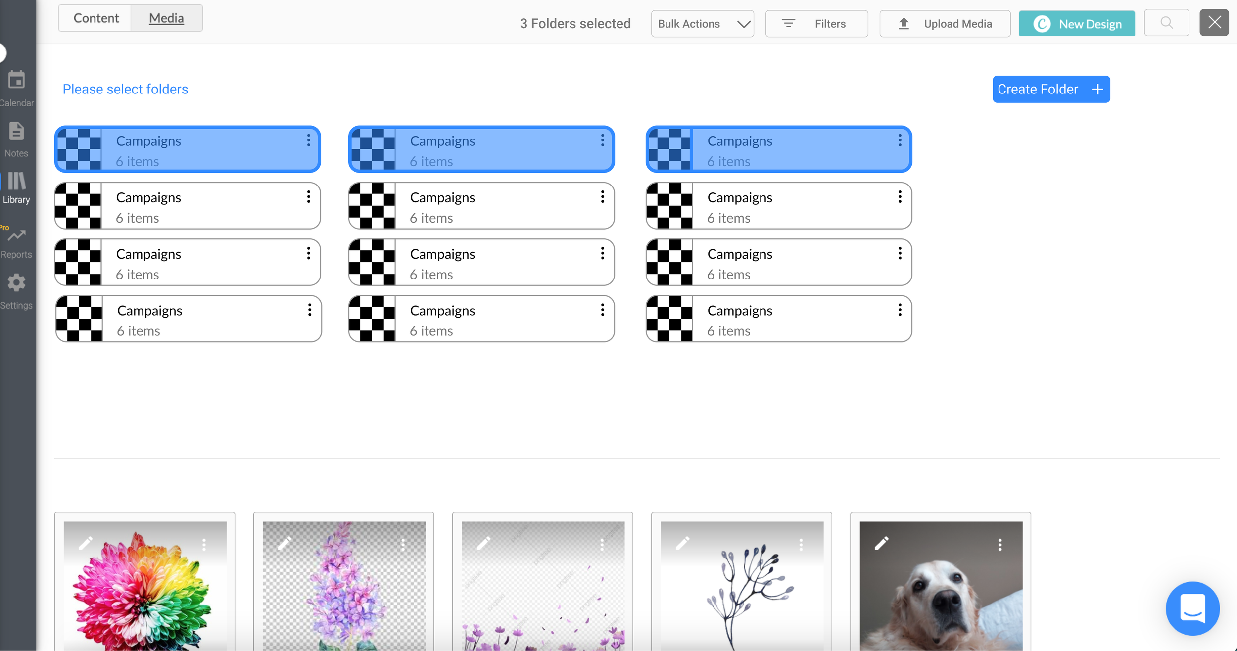
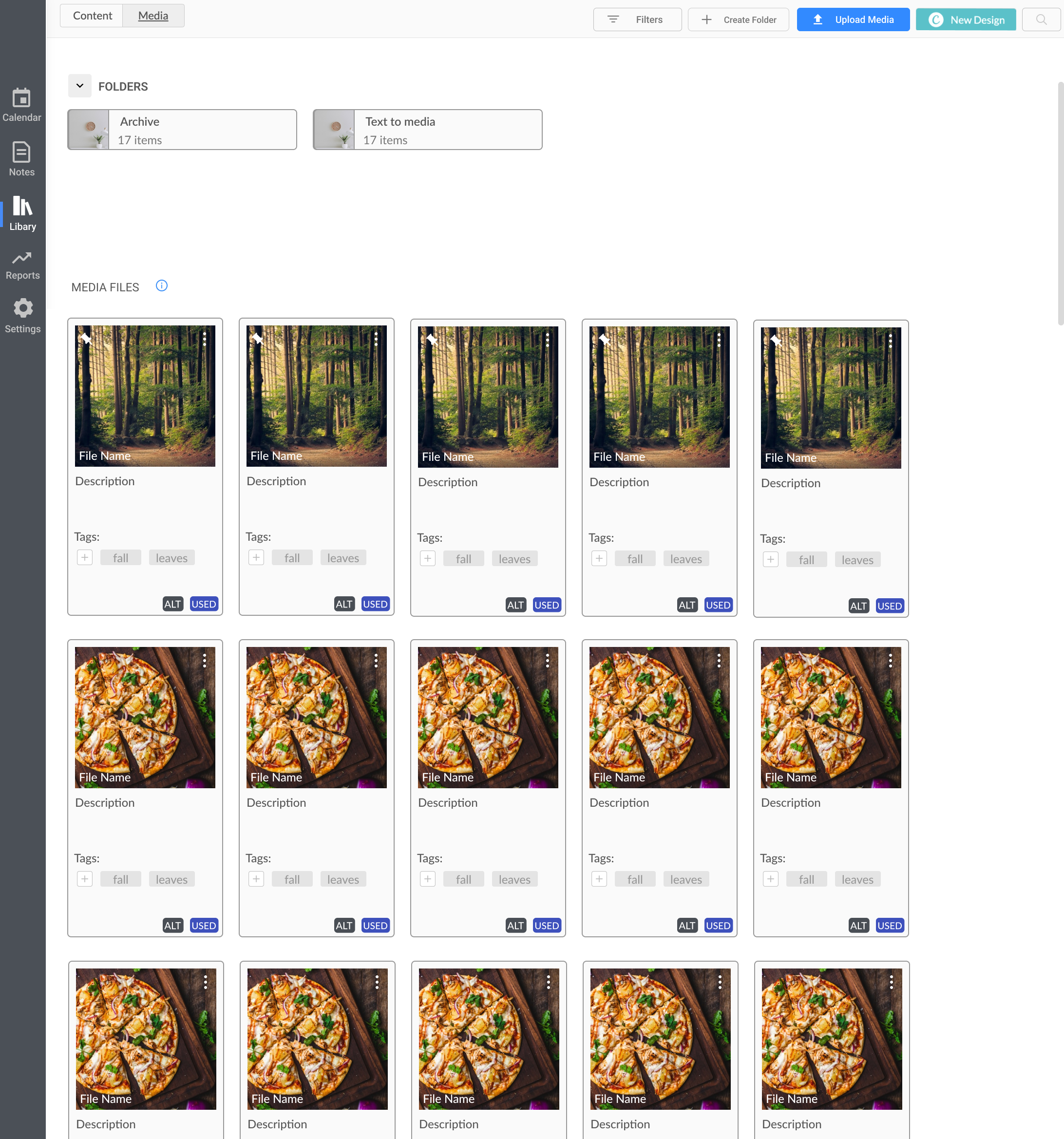
Folders in the Media Library
HeyOrca is a social media scheduler built for teams who rely on collaboration and approvals to streamline their content development process.
HeyOrca

Project Overview
Content creation and publishing is a core experience for our users. The media library allows them to easily upload and store media content to publish.
Our users wanted a more efficient way to organize their media and find what they need, faster.
Launch
Nov 2022
Timeline
24 weeks
What were our users saying about our current media library?
User Feedback and Use Cases
To start off the project, we collected feedback from our community and created a Team Figjam to brainstorm common themes that were opportunities to tackle in the media library. From those common themes, we were then able to create use cases that a user may want to see implemented into the feature.
-
•Is there a way to keep track and categorize media to save time look for it?
•Is there a way to handle multiple media at once?
•Is there a way to create folders instead of having them all on one page?
-
•Users wanted to sort media by folders
•Perform bulk actions on multiple pieces of media
•Filter media to easily find it in the library
Problem Space
Efficiency and organization were two common themes that our users wanted to improve with our current media library. We believed that by working on these areas in the media library, this would have a high impact for all users within HeyOrca.
•How could we help our users save more time when planning out their content?
•What are some ways we could improve the media library so that there is better organization?

Considerations & Questions
From the Team FigJam activity we decided that this project should be broken down into milestones. The first milestone will be the foundation to help our users start organizing in the library. We will then continue to iterate and add on more features and capabilities based on user feedback.
A few questions that we had to consider for our first milestone in regards to user experience were:
•How would implementing an organization system affect the current experience of the media library?
•What are we going to do with the current media that users have?
•Will this new system affect any other areas of the app?
•How will this new improvement look on the mobile browser?


Assumptions
There were also some assumptions that we had based on user feedback and the media library.
•The users who will be taking advantage of this feature improvement would be users who have a lot of media in their library
•We assumed that our users have used some sort of organization feature before
•We assumed that this feature improvement would have a high impact for most users
•We assumed that our users would want to adopt the new feature by dragging and dropping their current media into folders.
•For a consistent experience, users would also want to be able to conduct the same actions on the post modal (when attaching media to the post)

Competitive Analysis
Before brainstorming potential solutions, we needed to understand how other companies approach asset management and strategize ways to increase user efficiency in their library.
Questions:
•How are other platforms approaching asset management for their users?
•What is currently working for them and what are some potential improvements?
-
Pros:
-Clean interface allowing users to easily create folders
-Different views of the library; allowing users to see a list view and grid view
-Ability to view all media
Opportunities:
-Drag & drop capabilities
-Cannot conduct bulk actions on folders
-
Pros:
•Intuitive user interface; allows users to easily create folders or upload media
•Has a navigational breadcrumb which allows users to easily go to certain location in library
•List View & Grid view
•Separate folder for deleted files
Opportunities:
•Does not have the ability to conduct bulk actions
•Cannot move folders
-
Pros:
•Clean and easy to use interface
•Bulk selection on folders and media
•Ability to right click to view more options
•List view & grid view
•Navigational breadcrumb
Opportunities:
•The ability to create the same folder names on the same level (could cause organizational issues for users)
Low Fidelity Mock-up & Prototype
After conducting research and understanding what our users were looking for, I then mocked up a couple of iterations and got feedback from the team. With the teams’ feedback I was then able to finalize a set of designs to use for user testing.
Key use cases in prototype:
•User can create folders
•Users can rename folders
•Users could navigate into the folder and select different types of views
•Users can conduct “Bulk actions” on folders and media
•Users can use breadcrumb at top of the page for easy navigation
Figma Prototype
Feedback & Revisions
After conducting multiple usability tests with our users through zoom the main revisions that needed more thought was:
The ability to conduct bulk actions on media files
Creating an intuitive navigation for when users are in subfolders
Not clear on how to drag and drop media files
How can we make it more clear when their media was last used?
Options for navigation


Main page- Media Library
Main page- Media Library - Bulk Selecting
Design Handoff & Development
Breaking down the designs and adding context around the experience and behaviour of different screens was an important aspect in the design handoff. In addition, the development process consisted of weekly meetings to see the progress and answering any design questions or feedback that may arise.
First milestone consisted of:
•Allowing users to create folders
•Allowing users to organize folders
•Hot Keys
•Uploading multiple media in the post modal (other areas of the app that were impacted)
Testing & Official Launch
Before the official launch, we had an internal round of testing and once we felt confident in the product we then launched it to our Beta customers.
After making minor adjustments from the feedback, we were then ready for the official launch of Folders in the Media Library.
How it works:
•Users are able to create a folders
•Users are able to drag & drop media into folders
•Users are able to conduct bulk actions on media to quickly move them
•When users are attaching media onto their posts, the modal also has the same consistent experience of the media library (without the ability to create folders)
Conclusion
Results
Our users were ecstatic about the feature improvement to the media library. There were a lot of positive comments around the ease of use and simplicity of the feature. Of course, there are always room for improvement but we were able to deliver a feature that has proven to help take back our customers’ days!
Some feedback that we are considering for our next iteration are:
•Having more advanced filtering such as used media & unused media
•Allowing users to delete media/folders as well as archive
Archive folder and text to media folder
What’s Next?
We are currently still working on improving the media library and adding new capabilities for our users to efficiently use the feature.
Currently in progress:
•Allowing users to archive folders and media files
•Implementing a default folders for text to media

Retrospect
Can’t assume that all users will understand how to perform a certain action.
With bulk actions, we made the assumption that all users knew keyboard shortcuts and it was intuitive to select multiple media files by holding down hotkeys. We learned that communication is always key and certain actions are learned behaviours.
Breaking down the design into milestones will help with focus and allows for better communication
The approach of breaking down the designs into milestones and then further into specific tasks allowed for better development handoff as we were able to focus on certain parts of the project without falling into a rabbit hole.